Forms Builder
Form Builder is the interface for creating your Forms and Templates. You can add, remove and edit blocks for your Forms and Templates as you desire.
The Form Builder also lets you Preview your form before saving it so you can adjust it if needed.
Layout
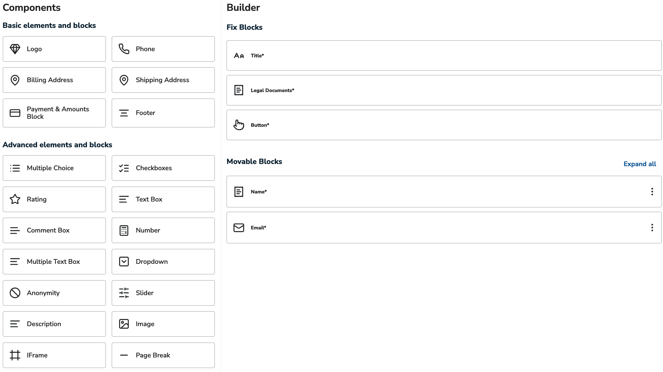
The left section lists the available blocks for your form. It has a basic and an advanced section.
The right section shows the Builder. It has a fixed and a movable section. Both display the blocks that appear on your form. You can edit them by clicking on them.
Fixed Blocks: It always contains a Title, the Legal Documents and the Button. The position of these elements is always fixed inside the form. You can optionally add the Logo block to the Fixed Blocks, which will appear at the top of the form.
Movable Blocks: It always contains the Name and Email blocks. The position of these elements depends on your preference. You can add as many blocks to this section as you wish.
Basic Actions
The basic actions are responsible for ordering, duplicating and removing blocks.
Block Order: Drag and drop the given block to the desired position using the three dots.
Block Duplication: Click on the copy icon to duplicate the given block.
Block Removal: Click on the bin icon to delete the given block.

Once a block has been deleted, the action cannot be undone.
Advanced Settings of Blocks
The Advanced section of each block lets you customize the title of the column displayed in the exported CSV.
Try to add descriptive titles so that you can easily recognize them.
Basic Elements
Basic elements let you create simple forms with just a few clicks.
Title
The Title component lets you choose the title of your form.
This is the title displayed to the users on the top the generated form.

Please be aware that it is always a required field.
Name
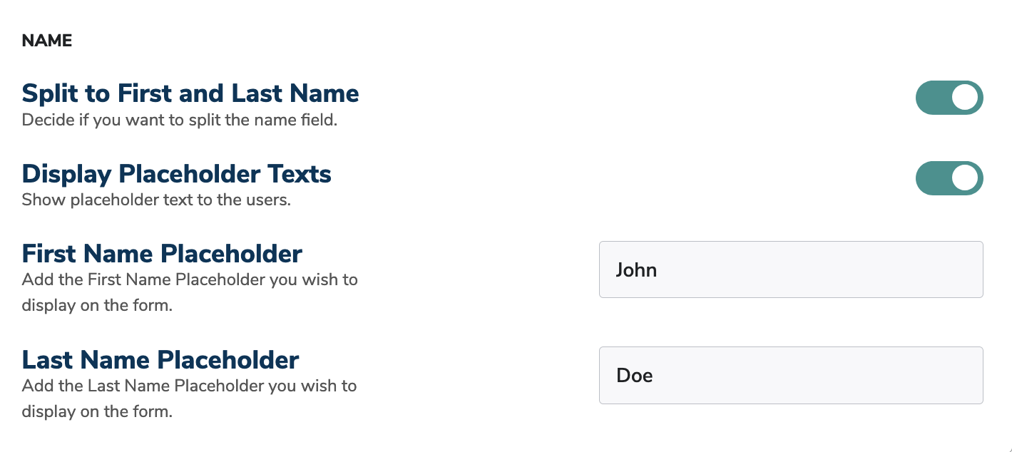
The Name component lets you customize the name field on your form.
Split to First and Last Name: Enable this feature to split the name fields to First and Last name. If it is turned off, only one field will be displayed without separation.
Display Placeholder Texts: Enable this feature to help your users with Placeholder text. Enter the desired placeholder text for better user experience.
Please be aware that it is always a required field.
Email
The Email component lets you customize the email field on your form.
Display Placeholder Texts: Enable this feature to help your users with Placeholder text. Enter the desired placeholder text for better user experience.

Please be aware that it is always a required field.
Logo
The Logo component lets you customize the logo displayed on your form.
The logo will always be displayed on the top of your form.
Use Default: This feature is enabled for you by default. If you wish to use a different logo for a given form, please turn this feature off.
Update Image: click on the Upload button to choose and upload the desired image. The name of the file is displayed later on for easier tracking. Click on the Trash icon if you wish to delete the uploaded image.
Technical details:
The logo component has a fixed width of 300px.
For aesthetic purposes only png formats are supported.
Logo component is an optional block. No logo is displayed without this block.
Phone
The Phone component lets you customize the phone field on your form.
Display Placeholder Texts: Enable this feature to help your users with Placeholder text. A placeholder will automatically be displayed on the form.

Billing Address
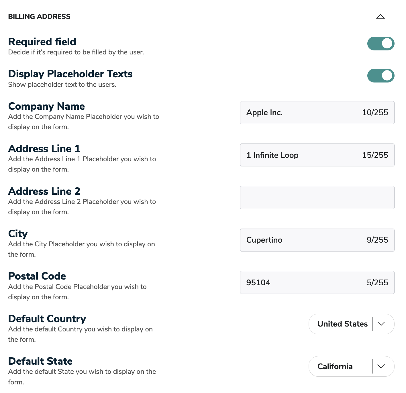
The Billing Address component lets you add a whole Billing Address block to your form with a single click.
Display Placeholder Texts: Enable this feature to help your users with Placeholder text. Enter the desired placeholder texts for better user experience. You can even choose the preselected country and state for your users.
Shipping Address
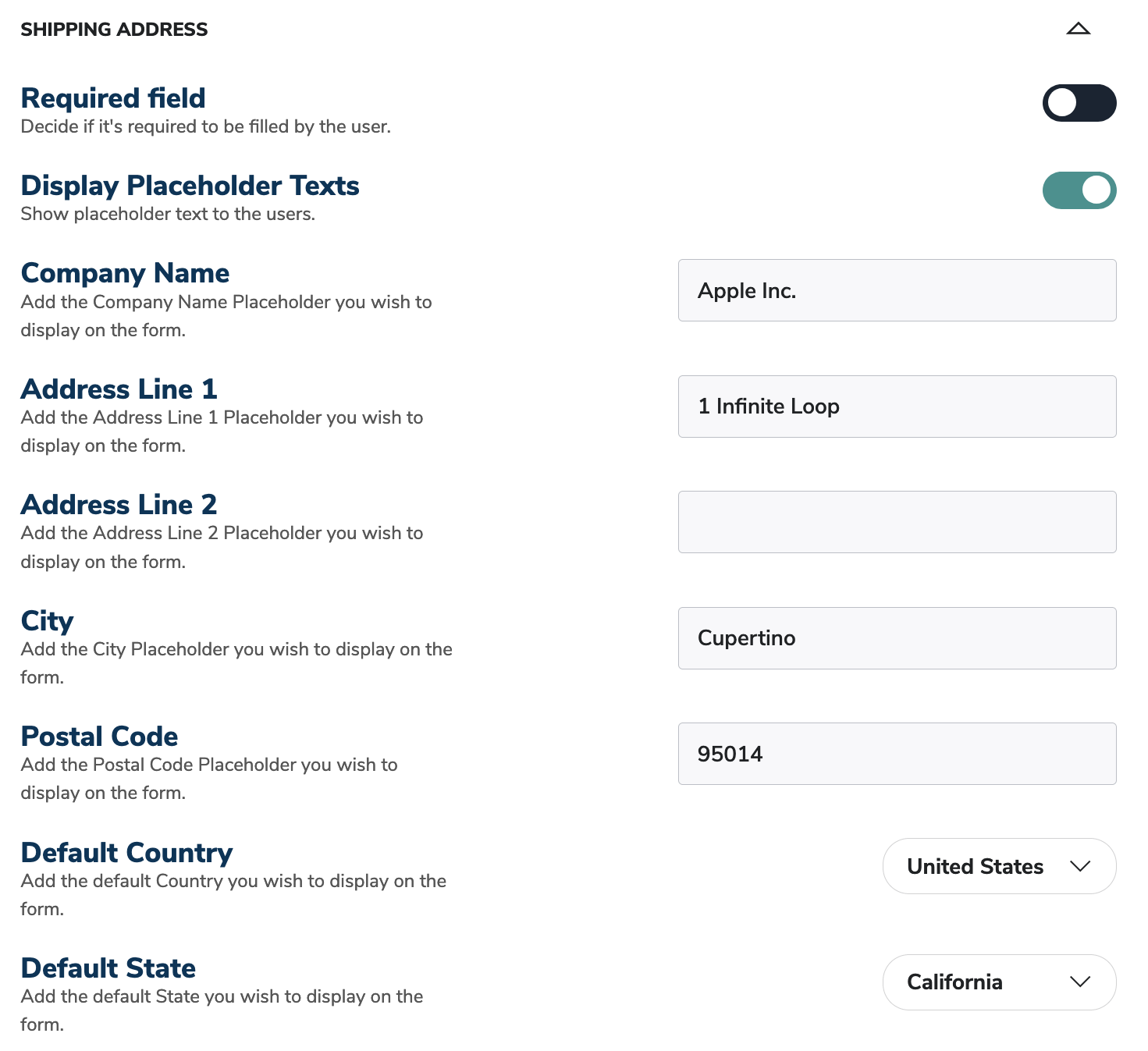
The Shipping Address component lets you add a whole Shipping Address block to your form with a single click.
Display Placeholder Texts: Enable this feature to help your users with Placeholder text. Enter the desired placeholder texts for better user experience. You can even choose the preselected country and state for your users.
Payment & Amounts Block
The Payment & Amounts Block component lets you add a whole Payment block and the desired amounts to the given form.
Selected Processor: Select the processor you wish to operate the given form with.
This feature might not be available depending on the connected gateway.
Card Payment: Enable this feature to accept Credit Card as a payment method for your form.
ACH Payment: Enable this feature to accept ACH as a payment method for your form.
Apple Pay Payment: Enable this feature to accept Apple Pay as a payment method for your form.
Google Pay Payment: Enable this feature to accept Google Pay as a payment method for your form.
Pre-Selected Payment Method: Choose the payment method that you wish to display to the user by default.
Please be aware that the payment block reflects your processor settings in the gateway.
The Basic Amount Settings section contains the most crucial settings of the Payment & Amounts block.
Transaction Type: Choose the type of transaction you wish to add to the form. It can be One Time, Recurring, One Time & Recurring (Simple) or One Time & Recurring (Advanced).
For the One Time & Recurring transaction type, the user decides the nature of the transaction. Advanced version lets the user create recurring transactions with custom amounts.
Layout Preferences: this feature lets you choose the option which fits your business and users the best. You can choose from checkbox, button and select.
Amount Fields: Enter the Amounts you wish to display to your users. Click on the Add Amount button to add additional amounts to the Form Builder. You can also delete them.
The Custom Amount Settings section contains settings about your custom amount preferences for a given form.
Custom Amount field: Enable this feature to give your users the option to enter a custom amount.
Custom Amount Limit: Enter the maximum amount that your users can enter into the custom amount input field in the form.
The Preselected Amount Settings section contains settings about your preselected amount preferences for a given form.
Preselected Amount: Enable this feature to choose a preselected amount from your amounts. It will be chosen for the users by default.
Upon enabling the preselected amount, the amount will be selected for the users by default. They can always change it to the desired amount if needed.
The Cover Platform Fee Settings section contains settings about your platform fee preferences for a given form.
Cover our Platform Fee Section: Enable this feature to give your users the option to enter an additional amount, hence covering your transaction fees. You can configure it the same way as you would configure amounts.
Please be aware that the platform fee amount is always added on top of the base amount.
Legal Documents
The Legal Documents Block component is responsible for the Privacy Policy, Refund Policy and Terms and Conditions.
The Legal Documents Block is displayed as a visual aid, no configuration can be made to it.
Please be aware that it is always a required field.
Button
The Button Block component lets you add the desired text to the button of the form. You can also redirect the user to the desired URL after submission.
Please be aware that it is always a required field.

Footer
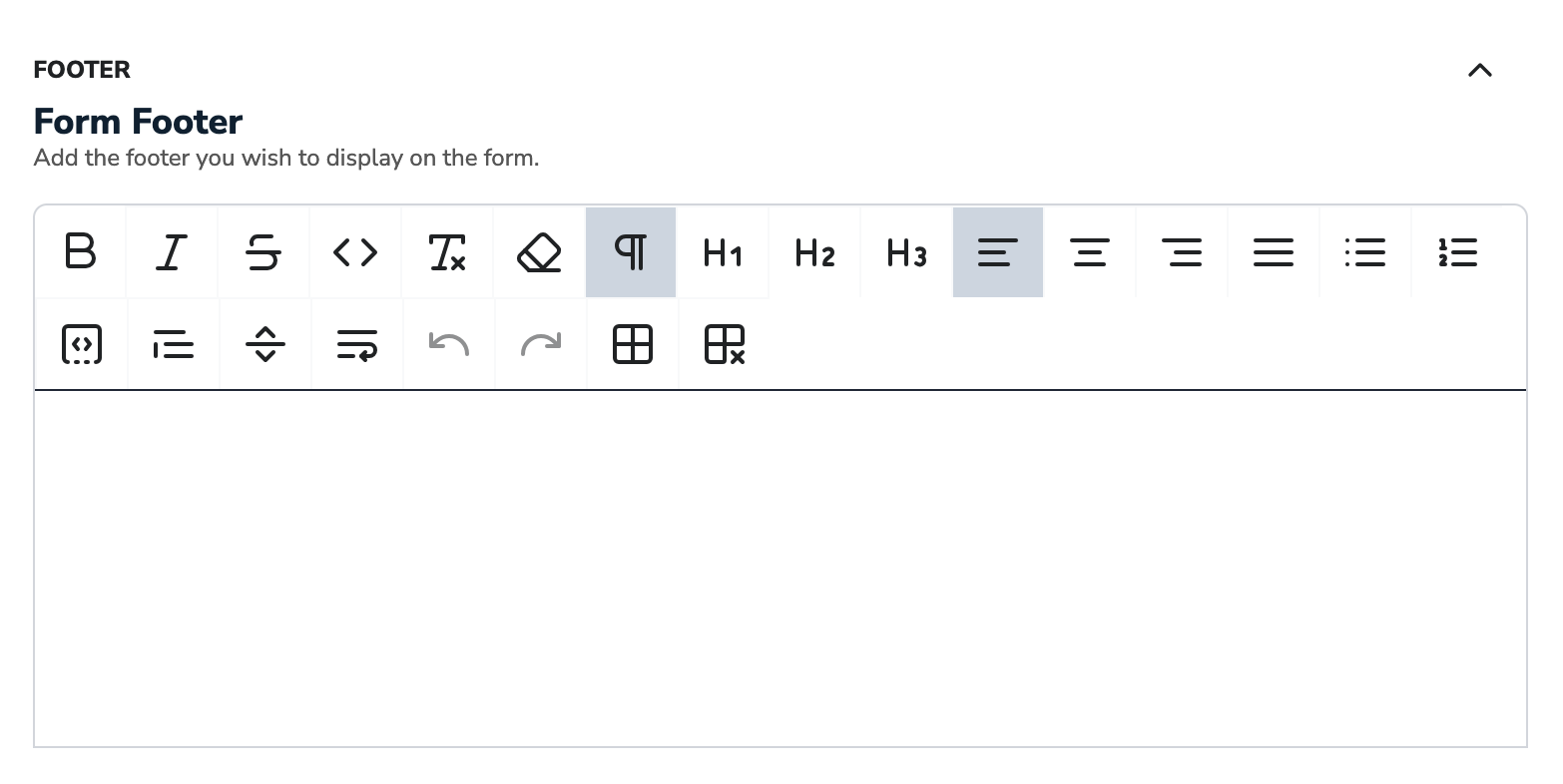
The Footer Block lets you add the desired text to the bottom of the form.
Please be aware that it is always a required field.
Advanced Elements
Advanced elements let you create more advanced forms with complex fields and structure.
Multiple choice
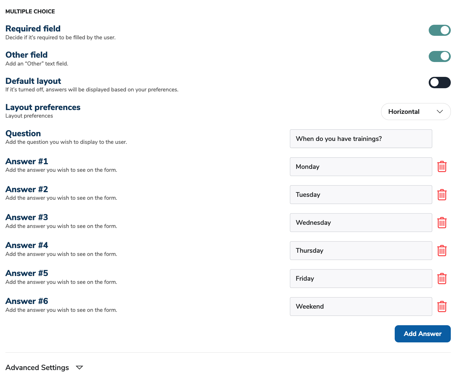
Multiple choice questions provide the users multiple answer options on the form. Users can select multiple answers to the questions based on their preference.
If you don't want the users to be able to select more than one answer, please use the Checkboxes Block.
Required field: Enable this feature to make this field required.
Other field: Enable this feature to make an "Other" field displayed to the users.
Default layout: Enable this feature to make changes in the default layout of the answers displayed. The Layout Preferences will let you choose from a vertical or horizontal layout.
Question: Enter the Question you wish to display to your users.
Answer Fields: Enter the Answers you wish to display to your users. Click on the Add Answer button to add additional amounts to the Form Builder. You can also delete them if not needed.
Checkboxes
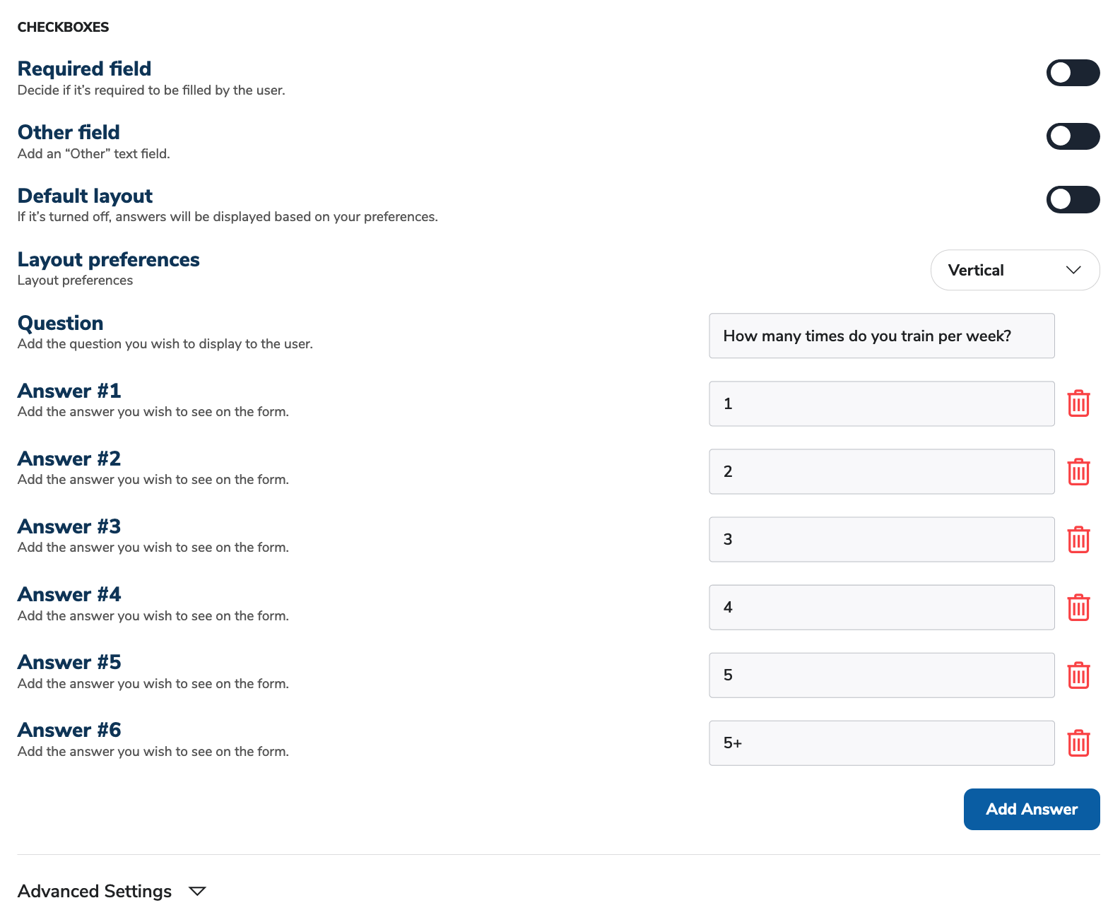
Multiple choice questions provide the users multiple answer options on the form. Using the Checkboxes Block users can select a single answer to the question based on their preference.
If you want the users to be able to select more than one answer, please use the Multiple choice Block.
Required field: Enable this feature to make this field required.
Other field: Enable this feature to make an "Other" field displayed to the users.
Default layout: Enable this feature to make changes in the default layout of the answers displayed. The Layout Preferences will let you choose from a vertical or horizontal layout.
Question: Enter the Question you wish to display to your users.
Answer Fields: Enter the Answers you wish to display to your users. Click on the Add Answer button to add additional amounts to the Form Builder. You can also delete them if not needed.
Rating
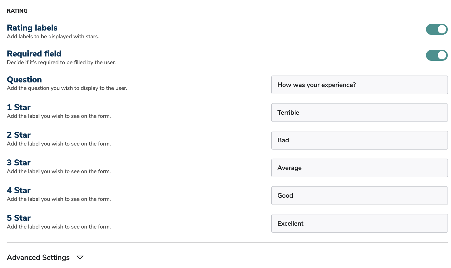
The Rating block lets your users rate an experience, idea, product, software etc.
Rating labels: Enable this feature to add custom labels for your star ratings.
Question: Enter the question you wish to display to the user.
Required field: Enable this feature to make this field required.
Text Box
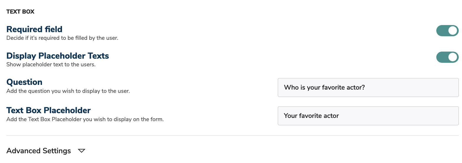
The Text box block lets you create one-line input fields.
If you want the users to be able to enter more than one answer, please use the Multiple Text box Block.
Required field: Enable this feature to make this field required.
Display Placeholder Texts: Enable this feature to help your users with Placeholder text. Enter the desired placeholder text for better user experience.
Question: Enter the question you wish to display to the user.
Technical details:
The Text box field has alphanumeric validation, meaning that users can enter alphabetic and numeric characters too.
Comment box
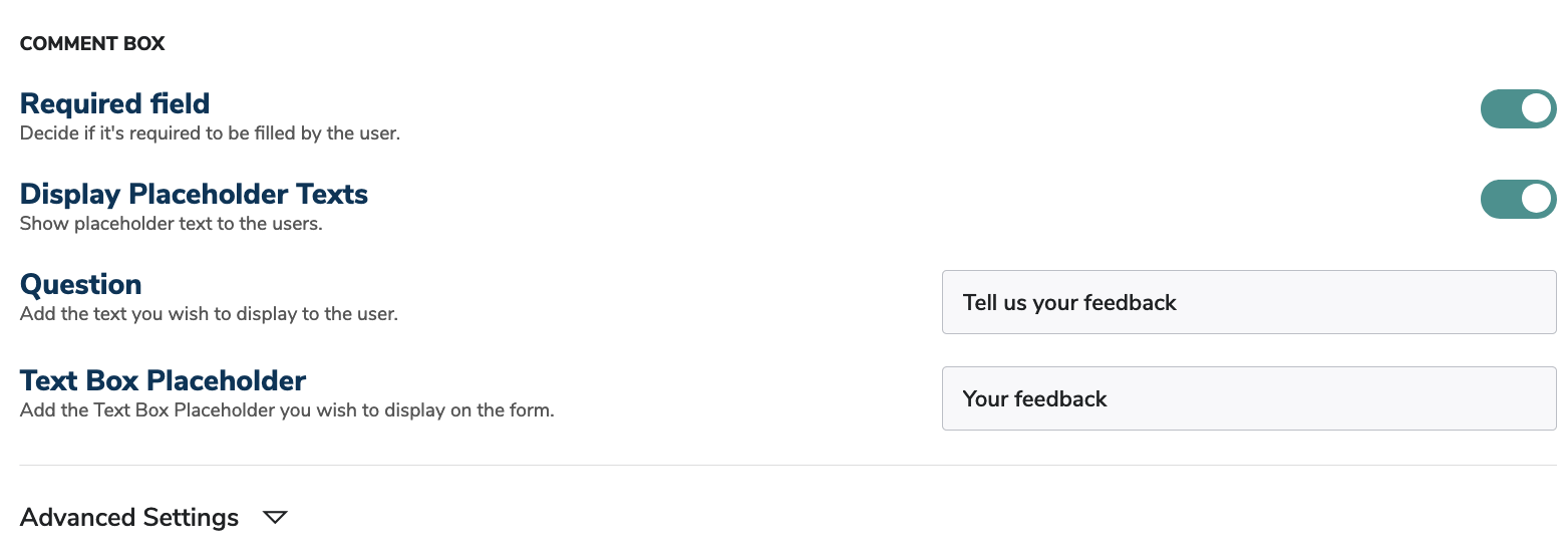
The Comment box block lets you create multi-line text area.
Required field: Enable this feature to make this field required.
Display Placeholder Texts: Enable this feature to help your users with Placeholder text. Enter the desired placeholder text for better user experience.
Question: Enter the question you wish to display to the user.
Technical details: The Text box field has alphanumeric validation, meaning that users can enter alphabetic and numeric characters too.
Number
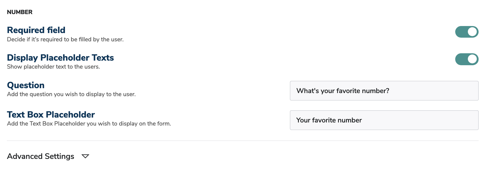
The Number block lets you create one-line number fields.
Required field: Enable this feature to make this field required.
Display Placeholder Texts: Enable this feature to help your users with Placeholder text. Enter the desired placeholder text for better user experience.
Question: Enter the question you wish to display to the user.
Please keep in mind that the Number field is validated for numeric characters. Users cannot enter alphabetic characters into this field.
Multiple Text Box
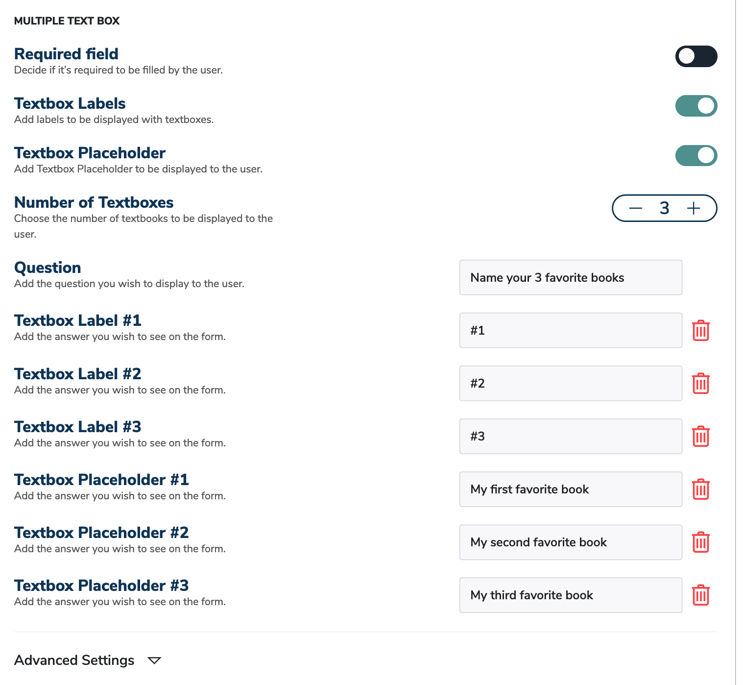
The Text box block lets you create multiple input fields.
If you want the users to only be able to enter one answer, please use the Text box Block.
Required field: Enable this feature to make this field required.
Text box Labels: Enable this feature to create labels for every text box. These can be questions or guidelines for your users.
Text box Placeholder: Enable this feature to help your users with Placeholder text. Enter the desired placeholder text for better user experience.
Number of Text boxes: Choose the number of text boxes you wish to display to your users.
Question: Enter the question you wish to display to the user.
Technical details:
The Text box field has alphanumeric validation, meaning that users can enter alphabetic and numeric characters too.
Dropdown
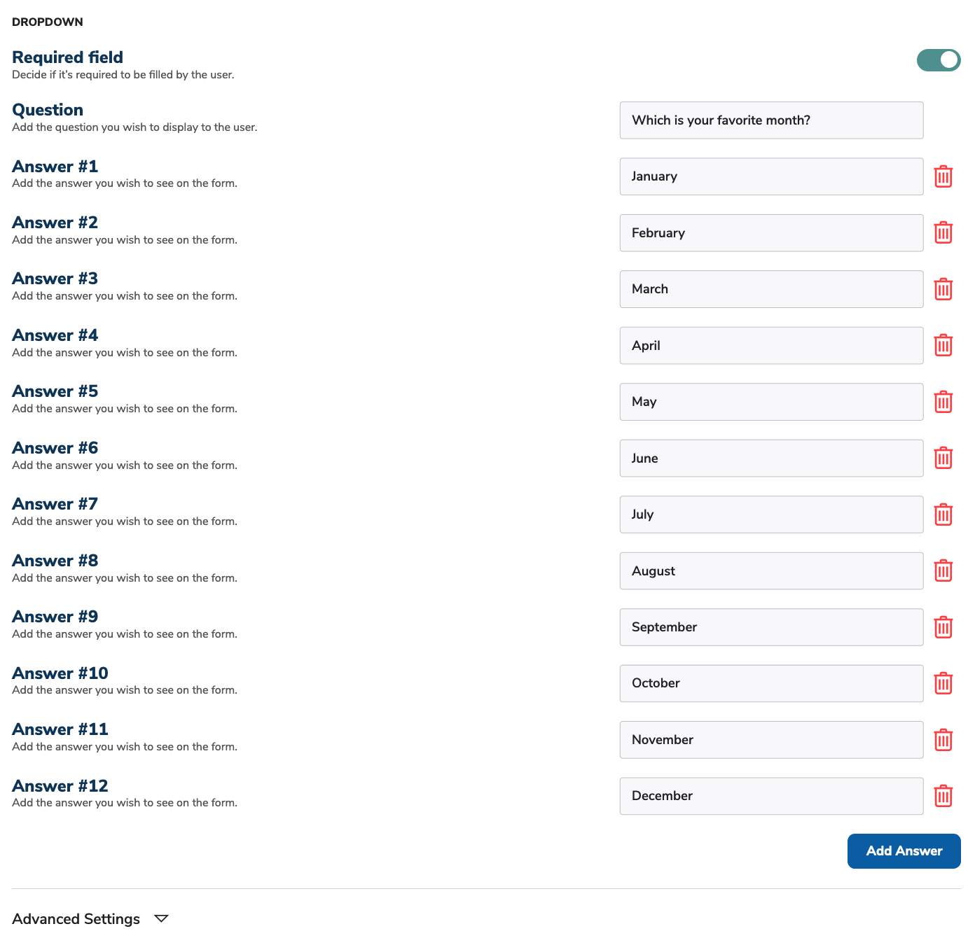
The Dropdown block lets you create single select dropdown fields. It is ideal when there are various answers to be displayed without overwhelming the users.
Required field: Enable this feature to make this field required.
Question: Enter the question you wish to display to the user.
Answer Fields: Enter the Answers you wish to display to your users. Click on the Add Answer button to add additional amounts to the Form Builder. You can also delete them if not needed.
Anonymity
The Anonymity block lets your users opt out if they don't want their data to be collected.
Anonymity Text: Enter the text you wish to display to the user.

Please keep in mind that if the switch is turned off, the data will be saved. If it is turned on, the data won't be saved. Please enter your text accordingly.
Slider
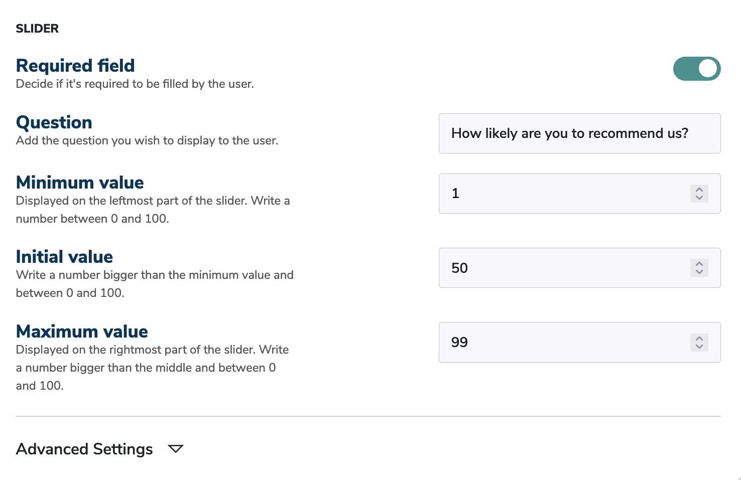
The Slider block lets you create a linear scale which users can adjust based on their answers.
Required field: Enable this feature to make this field required.
Question: Enter the question you wish to display to the user.
Minimum value: Enter the number you wish to display to the user. This will be on the leftmost part of the slider.
Enter the number you wish to display on the slider by default.
Maximum value: Enter the number you wish to display to the user. This will be on the rightmost part of the slider.
Please keep in mind that the maximum value must be bigger than the minimum value.
Description
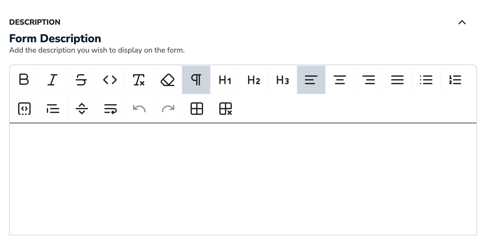
The Description block lets you add longer texts for your form. It can be a subtitle under the title or a description between other blocks.
Form Description: Enter the description you wish to display to the user.
Image
The Image component lets you add an image to your form.
Stretch image to full width: Enable this feature to stretch your image to the full width of your form.
You can only upload PNG files. Please keep in mind that the resolution and image size is really important for an aesthetic form.

IFrame
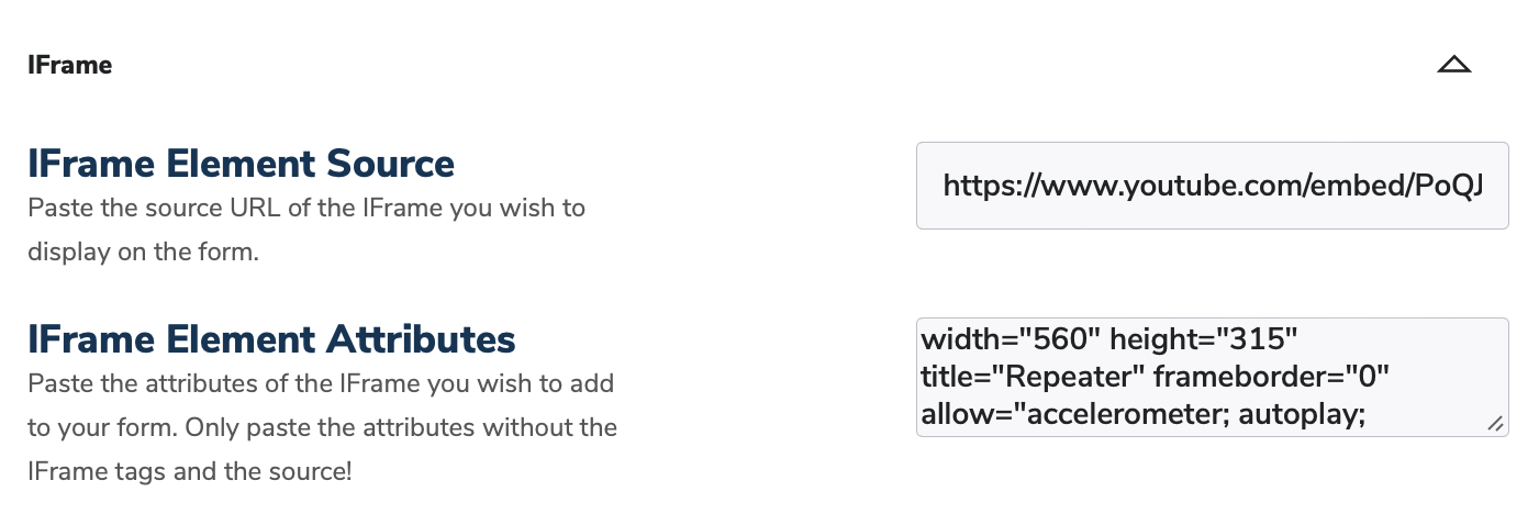
The IFrame component lets you add an IFrame element to your form. The IFrame will be generated based on your inputs. That's why you only need to add the Source and the Attributes of the IFrame, not the whole element itself.
IFrame Element Source: Enter the URL of the IFrame you wish to display to the user. Only the URL is needed for this input field.
IFrame Element Attributes: Enter the Attributes of the IFrame you wish to display to the user.
Don't add the Source and the IFrame tags to the Attributes input.
Page Break
The Page Break component lets you add pages to your form. One Page Break block will divide the form into 2 pages. The first page and its content will be displayed before the Page Break block. The second page and its content will be displayed after the Page Break block.
You can add as many Pages Breaks as you wish. Please always preview your form to make sure that the pages are functional and aesthetically pleasing.
